source-apps
The Source library for Android
Add the library dependency
Add the dependency to build.gradle.kts for the consuming module.
In build.gradle.kts:
implementation("com.gu.source:source-android:<version>")
In version catalog:
[versions]
source = "<version>"

[libraries]
source = { module = "com.gu.source:source-android", version.ref = "source" }
[!note] See here if you need to build and bundle the library as a local repository.
Using the library
The library provides design presets and components.
The design presets are available name spaced under the com.gu.Source object, e.g. Source.Typography.HeadlineBold15.
Full API documentation is available here.
Presets
Typography
Typography presets include fontFamily, fontSize, lineHeight, fontWeight, fontStyle in a single token. All typography tokens with their previews are listed here
The library bundles app font files, so they are not separately required in consumer apps.
Use typography presets directly in a Text component.
Text(
    text = "The world's leading liberal voice",
    // Using Source typography preset
    style = Source.Typography.TextEgyptianItalic14,
)
Palette colours
Core palette colours are available for direct use in components through Source.Palette. Preview all available colours here.
Text(
    text = "The world's leading liberal voice",
    // Using Source palette colours
    color = Source.Palette.Brand400,
)
Icons
Icons are available as ImageVector objects under the Source.Icons.Base namespace. The library provides a set of icons that can be used directly in components.
See here for all available icons.
Icon(
    imageVector = Source.Icons.Base.Checkmark,
    contentDescription = null,
)
Components
Buttons
Four core button components are available - SourceButton, SourceIconButton, PlainSourceButton and SourceBaseIconButton.
See here for full details of the button components.
Chips
Chip components are typically used for filter, tags, or actions in a concise format.
See here for full details of the chip components.
Promo stickers
The Promo Sticker is a visual indicator used to draw user attention to new or recommended products without disrupting the interface. They are available in two sizes and four styles.
See here for full details of the promo sticker components.
Pager progress components
Three pager progress components are available:
PagerProgressBar- a higher level component that combines the two components below, and has different phone and tablet behaviour.PagerProgressIndicator- a set of highly customisable indicators to signify progress as a user progresses through the items in the pager.PagerProgressButtons- buttons to allow user to go to next/previous page in a pager.
See here for more details on pager progress components.
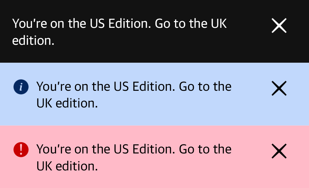
Alert banners
The AlertBanner component is used to display alerts at the top of the screen. It supports three
alert priorites - Neutral, Info and Error. The three alert priorities have different display
styles corresponding to Source specifications.
Usage example
AlertBanner(
    text = "This is an alert banner",
    priority = AlertBanner.Priority.Info,
    onMessageClick = { /* Handle action */ },
    onDismiss = { /* Handle dismiss */ },
    modifier = Modifier.fillMaxWidth(),
)

Building and using directly
As a bundled repo
- Build the library
Run
./gradlew :source:publishReleasePublicationToGusourceRepositoryThis will produce the library output at
/source/build/gusource/. -
Copy the built library to the news app Copy the library the built folder from
/source/build/gusource/to theandroid-news-app/src/main/libs/mavenfolder in theandroid-news-apprepo. - Update the version number in the news app If the library version has changed, update it in the version catalog for the news app.
From maven local
- Build the library
Run
./gradlew :source:publishToMavenLocalThis will publish the library to your local maven repository.
-
Update the version number in the news app If the library version has changed, update it in the version catalog for the news app.
- Ensure you have
mavenLocaldeclared first in your repositoriesrepositories { mavenLocal() mavenCentral() google() }
Other notes
- We use the
com.gupackage name and group id so we can use the Guardian’s Sonatype infra for signing and publishing the library. See this comment for reference.